ID #gimme-code-2013-0011.html#
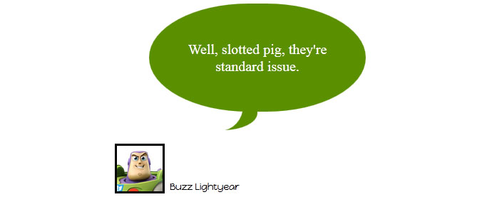
CSS Tips and Tricks – Great Looking Oval Speech Balloon.
Pure CSS3 only, no images, and no JavaScript.
Source Code:
<!DOCTYPE html>
<html>
<!-- Don't Break My b***s - Gimme Code! Project                                              -->
<!-- Author: Andrea Tonin - http://blog.lucedigitale.com                                     -->
<!-- This code come with absolutely no warranty                                              -->
<!-- If you use this code in your project please give a link to http://blog.lucedigitale.com -->
<!-- Thanks in advance                                                                       -->
<head>
<title>Title</title>

<!-- Google Fonts -->
<link href='http://fonts.googleapis.com/css?family=Happy+Monkey' rel='stylesheet' type='text/css'>

<style type="text/css">

.wrapper-baloons {
    padding: 4em;
    width: 25em;
}
.speakername{
    font-family: 'Happy Monkey', cursive;
	font-size: 0.8em;
	margin-top: -3em;
	margin-left: 6em;
}
.speakerthumb{
    width: 4em;
	height: 4em;
	margin: 1em;
	margin-top: -1.2em;
	margin-left: 0em;
	border: 0.2em solid black;
}
/* OVAL STYLE 1 SPEECH START */
.oval-speech-1 {
	position:relative;
	width:15em;
	padding:2em 2em;
	margin:1em auto 4em;
	text-align:center;
	color:#fff;
	background:#5a8f00;
	-webkit-border-top-left-radius:22em 12em;
	-webkit-border-top-right-radius:22em 12em;
	-webkit-border-bottom-right-radius:22em 12em;
	-webkit-border-bottom-left-radius:22em 12em;
	-moz-border-radius:22em / 12em;
	border-radius:22em / 12em;
}

.oval-speech-1 p {font-size:1.25em;}

/* creates first part of the pipe */
.oval-speech-1:before {
	content:"";
	position:absolute;
	z-index:-1;
	bottom:-1.8em;
	right:50%;
	height:3em;
	border-right:3em solid #5a8f00;
	background:#5a8f00; /* need this for webkit - bug in handling of border-radius */
	/* css3 */
	-webkit-border-bottom-right-radius:4em 2em;
	-moz-border-radius-bottomright:4em 2em;
	border-bottom-right-radius:4em 2em;
	/* using translate to avoid undesired appearance in CSS2.1-capabable but CSS3-incapable browsers */
	-webkit-transform:translate(0, -0.2em);
	-moz-transform:translate(0, -0.2em);
	-ms-transform:translate(0, -0.2em);
	-o-transform:translate(0, -0.2em);
	transform:translate(0, -0.2em);
}

/* creates second part of the pipe */
.oval-speech-1:after {
	content:"";
	position:absolute;
	z-index:-1;
	bottom:-1.9em;
	right:46%;
	width:3em;
	height:3em;
	background:#fff;
	/* css3 */
	-webkit-border-bottom-right-radius:2em 2.2em;
	-moz-border-radius-bottomright:2em 2.2em;
	border-bottom-right-radius:2em 2.2em;
	/* using translate to avoid undesired appearance in CSS2.1-capabable but CSS3-incapable browsers */
	-webkit-transform:translate(-3em, -0.2em);
	-moz-transform:translate(-2em, -0.2em);
	-ms-transform:translate(-2em, -0.2em);
	-o-transform:translate(-2em, -0.2em);
	transform:translate(-2em, -0.2em);
}

/* OVAL STYLE 1 SPEECH END */
</style>

</head>

<body>
<div class="wrapper-baloons">
<!-- css oval speech bubble START -->
<blockquote class="oval-speech-1">
<p>Well, slotted pig, they're standard issue.</p>
</blockquote>
<img class="speakerthumb" src="http://www.lucedigitale.com/blog/wp-content/uploads/2013/08/buzz-lightyear.png">
<p class="speakername">Buzz Lightyear</p>
<!-- css oval speech bubble END -->
</div>
</body>

</html>
DEMO