ID #gimme-code-2013-0007.html#
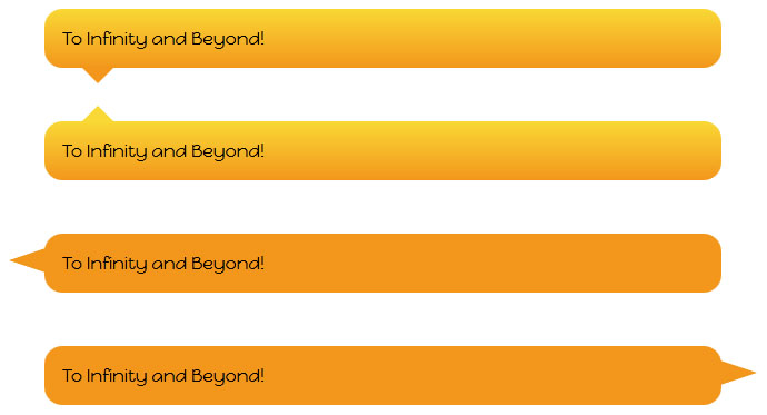
In these tutorial discover how to create a CSS Pure Speech Bubble Without Images.
You can create a great looking speech bubble with a few lines of CSS3 code, no images, and no JavaScript.
Source Code:
<!DOCTYPE html>
<html>
<!-- Don't Break My b***s - Gimme Code! Project                                              -->
<!-- Author: Andrea Tonin - http://blog.lucedigitale.com                                     -->
<!-- This code come with absolutely no warranty                                              -->
<!-- If you use this code in your project please give a link to http://blog.lucedigitale.com -->
<!-- Thanks in advance                                                                       -->
<head>
<title>Title</title>

<!-- Google Fonts -->
<link href='http://fonts.googleapis.com/css?family=Happy+Monkey' rel='stylesheet' type='text/css'>

<style type="text/css">

.wrapper-baloons {
    padding: 4em;
}
/* ################################################## */
/* BALOON BOTTOM START */
.speechballoon-bottom {
    font-family: 'Happy Monkey', cursive;
	position:relative;
	padding:1em; /* use em not px for responsive design */
	margin:1em 0 3em;
	color:#000;
	background:#f3961c; /* background for browsers without gradient support */
	/* gradient */
	background:-webkit-gradient(linear, 0 0, 0 100%, from(#f9d835), to(#f3961c));
	background:-moz-linear-gradient(#f9d835, #f3961c);
	background:-o-linear-gradient(#f9d835, #f3961c);
	background:linear-gradient(#f9d835, #f3961c);
	-webkit-border-radius:1em;
	-moz-border-radius:1em;
	border-radius:1em;
}
/* PIPE BOTTOM */
.speechballoon-bottom:after {
	content:"";
	position:absolute;
	bottom:-0.9em; /* vertical position */
	left:2em; /* horizontal position */
	border-width:1em 1em 0; /* the angle of the pipe */
	border-style:solid;
	border-color:#f3961c transparent;
    /* reduce the damage in FF3.0 */
    display:block;
    width:0;
}
/* BALOON BOTTOM END */
/* ################################################## */
/* ################################################## */
/* BALOON TOP START */
.speechballoon-top {
    font-family: 'Happy Monkey', cursive;
	position:relative;
	padding:1em; /* use em not px for responsive design */
	margin:1em 0 3em;
	color:#000;
	background:#f3961c; /* background for browsers without gradient support */
	/* gradient */
	background:-webkit-gradient(linear, 0 0, 0 100%, from(#f9d835), to(#f3961c));
	background:-moz-linear-gradient(#f9d835, #f3961c);
	background:-o-linear-gradient(#f9d835, #f3961c);
	background:linear-gradient(#f9d835, #f3961c);
	-webkit-border-radius:1em;
	-moz-border-radius:1em;
	border-radius:1em;
}
/* PIPE TOP */
.speechballoon-top:after {
    content:"";
	position:absolute;
	top:-0.9em; /* vertical position */
	left:2em; /* horizontal position */
	border-width:0 1em 1em; /* the angle of the pipe */
	border-style:solid;
	border-color:#f9d835 transparent;
    /* reduce the damage in FF3.0 */
    display:block;
    width:0;
}
/* BALOON TOP END */
/* ################################################## */
/* ################################################## */
/* BALOON LEFT START */
.speechballoon-left {
    font-family: 'Happy Monkey', cursive;
	position:relative;
	padding:1em; /* use em not px for responsive design */
	margin:1em 0 3em;
	color:#000;
	background:#f3961c; /* background for browsers without gradient support */
	-webkit-border-radius:1em;
	-moz-border-radius:1em;
	border-radius:1em;
}
/* PIPE LEFT */
.speechballoon-left:after {
    content:"";
	position:absolute;
	top:0.5em; /* vertical position */
	left:-2em; /* horizontal position */
	border-width:1em 3em 1em 0; /* the angle of the pipe */
	border-style:solid;
	border-color:transparent #f3961c;
    /* reduce the damage in FF3.0 */
    display:block;
    width:0;
}
/* BALOON LEFT END */
/* ################################################## */
/* ################################################## */
/* BALOON RIGHT START */
.speechballoon-right {
    font-family: 'Happy Monkey', cursive;
	position:relative;
	padding:1em; /* use em not px for responsive design */
	margin:1em 0 3em;
	color:#000;
	background:#f3961c; /* background for browsers without gradient support */
	-webkit-border-radius:1em;
	-moz-border-radius:1em;
	border-radius:1em;
}
/* PIPE RIGHT */
.speechballoon-right:after {
    content:"";
	position:absolute;
	top:0.5em; /* vertical position */
	right:-2em; /* horizontal position */
	border-width:1em 0em 1em 3em; /* the angle of the pipe */
	border-style:solid;
	border-color:transparent #f3961c;
    /* reduce the damage in FF3.0 */
    display:block;
    width:0;
}
/* BALOON RIGHT END */
/* ################################################## */
</style>

</head>

<body>
<div class="wrapper-baloons">
<p class="speechballoon-bottom">To Infinity and Beyond!</p>
<p class="speechballoon-top">To Infinity and Beyond!</p>
<p class="speechballoon-left">To Infinity and Beyond!</p>
<p class="speechballoon-right">To Infinity and Beyond!</p>
</div>
</body>

</html>
You can get the bubble with a html box element as – p – or – div -, and use CSS – border-radius – property.
To create the triangular bubble pointer you can use CSS borders property to create any type of triangle, notice:
border-width:1em 1em 0; /* the angle of the pipe */
border-style:solid;
border-color:#f3961c transparent;
DEMO