ID #gimme-code-2013-0009.html#
CSS Tricks – Perfect Black and White Comic Speech Baloon!
CSS3 only, no images, and no JavaScript.
Source Code:
<!DOCTYPE html>
<html>
<!-- Don't Break My b***s - Gimme Code! Project -->
<!-- Author: Andrea Tonin - http://blog.lucedigitale.com -->
<!-- This code come with absolutely no warranty -->
<!-- If you use this code in your project please give a link to http://blog.lucedigitale.com -->
<!-- Thanks in advance -->
<head>
<title>Title</title>
<!-- Google Fonts -->
<link href='http://fonts.googleapis.com/css?family=Happy+Monkey' rel='stylesheet' type='text/css'>
<style type="text/css">
.wrapper-baloons {
padding: 4em;
}
.speakername{
font-family: 'Happy Monkey', cursive;
font-size: 0.8em;
margin-top: -3em;
margin-left: 6em;
}
.speakerthumb{
width: 4em;
height: 4em;
margin: 1em;
margin-top: -1.2em;
margin-left: 0em;
border: 0.2em solid black;
}
/* ################################################## */
/* ROUNDED BALOON BOTTOM PIPE START */
.speechballoon-rounded-bottom {
font-family: 'Happy Monkey', cursive;
font-size: 1em;
position:relative;
padding:1em; /* use em not px for responsive design */
margin:1em 0 3em;
color:#000;
background:#ffffff;
-webkit-border-radius:1em;
-moz-border-radius:1em;
border-radius:1em;
border:3px solid black;
}
/* BIG PIPE BOTTOM */
.speechballoon-rounded-bottom:before {
content:"";
position:absolute;
bottom:-1em; /* controls vertical position */
left:1em; /* controls horizontal position */
border-width:1em 1em 0;
border-style:solid;
border-color:black transparent;
/* reduce the damage in FF3.0 */
display:block;
width:0;
}
/* SMALL PIPE BOTTOM */
.speechballoon-rounded-bottom:after {
content:"";
position:absolute;
bottom:-0.7em; /* controls vertical position */
left:1.3em; /* controls horizontal position */
border-width:0.7em 0.7em 0;
border-style:solid;
border-color:white transparent;
/* reduce the damage in FF3.0 */
display:block;
width:0;
}
/* ROUNDED BALOON BOTTOM PIPE END */
/* ################################################## */
/* ################################################## */
/* SHARP BALOON BOTTOM PIPE START */
.speechballoon-sharp-bottom {
font-family: 'Happy Monkey', cursive;
font-size: 1em;
position:relative;
padding:1em; /* use em not px for responsive design */
margin:1em 0 3em;
color:#000;
background:#ffffff;
-webkit-border-radius:1em;
-moz-border-radius:1em;
border:3px solid black;
}
/* BIG PIPE BOTTOM */
.speechballoon-sharp-bottom:before {
content:"";
position:absolute;
bottom:-1em; /* controls vertical position */
left:1em; /* controls horizontal position */
border-width:1em 1em 0;
border-style:solid;
border-color:black transparent;
/* reduce the damage in FF3.0 */
display:block;
width:0;
}
/* SMALL PIPE BOTTOM */
.speechballoon-sharp-bottom:after {
content:"";
position:absolute;
bottom:-0.7em; /* controls vertical position */
left:1.3em; /* controls horizontal position */
border-width:0.7em 0.7em 0;
border-style:solid;
border-color:white transparent;
/* reduce the damage in FF3.0 */
display:block;
width:0;
}
/* SHARP BALOON BOTTOM PIPE END */
/* ################################################## */
/* ################################################## */
/* SHARP BALOON DOTTED BOTTOM PIPE START */
.speechballoon-sharp-dotted-bottom {
font-family: 'Happy Monkey', cursive;
font-size: 1em;
position:relative;
padding:1em; /* use em not px for responsive design */
margin:1em 0 3em;
color:#000;
background:#ffffff;
-webkit-border-radius:1em;
-moz-border-radius:1em;
border:3px dotted black;
}
/* BIG PIPE BOTTOM */
.speechballoon-sharp-dotted-bottom:before {
content:"";
position:absolute;
bottom:-1em; /* controls vertical position */
left:1em; /* controls horizontal position */
border-width:1em 1em 0;
border-style:solid;
border-color:black transparent;
/* reduce the damage in FF3.0 */
display:block;
width:0;
}
/* SMALL PIPE BOTTOM */
.speechballoon-sharp-dotted-bottom:after {
content:"";
position:absolute;
bottom:-0.7em; /* controls vertical position */
left:1.3em; /* controls horizontal position */
border-width:0.7em 0.7em 0;
border-style:solid;
border-color:white transparent;
/* reduce the damage in FF3.0 */
display:block;
width:0;
}
/* SHARP BALOON DOTTED BOTTOM PIPE END */
/* ################################################## */
</style>
</head>
<body>
<div class="wrapper-baloons">
<!-- Speech Baloon 1 Rounded START -->
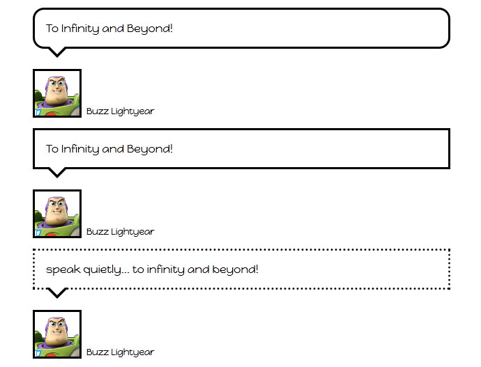
<p class="speechballoon-rounded-bottom">To Infinity and Beyond!</p>
<img class="speakerthumb" src="http://www.lucedigitale.com/blog/wp-content/uploads/2013/08/buzz-lightyear.png">
<p class="speakername">Buzz Lightyear</p>
<!-- Speech Baloon 1 Rounded END -->
<!-- Speech Baloon 2 Corner START -->
<p class="speechballoon-sharp-bottom">To Infinity and Beyond!</p>
<img class="speakerthumb" src="http://www.lucedigitale.com/blog/wp-content/uploads/2013/08/buzz-lightyear.png">
<p class="speakername">Buzz Lightyear</p>
<!-- Speech Baloon 2 Corner END -->
<!-- Speech Baloon 2 Corner START -->
<p class="speechballoon-sharp-dotted-bottom">speak quietly... to infinity and beyond!</p>
<img class="speakerthumb" src="http://www.lucedigitale.com/blog/wp-content/uploads/2013/08/buzz-lightyear.png">
<p class="speakername">Buzz Lightyear</p>
<!-- Speech Baloon 2 Corner END -->
</div>
</body>
</html>
Notice: to create a great looking pipe you need a small white pipe over a big black pipe.
DEMO