ID #gimme-code-2013-0002.html#
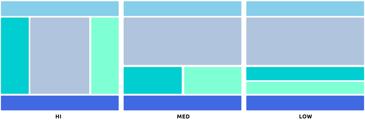
Easy Responsive Skeleton:
– Responsive
– 3 Breakpoint
– Header + Footer + Content + Left Sidebar + Right Sidebar
– HTML5 + CSS3
Clean, super flexible and fully responsive design!
Ok guys, let’s do this!
HTML source code:
<!DOCTYPE html>
<html>
<!-- Don't Break My b***s - Gimme Code! Project                                              -->
<!-- Author: Andrea Tonin - http://blog.lucedigitale.com                                     -->
<!-- This code come with absolutely no warranty                                              -->
<!-- If you use this code in your project please give a link to http://blog.lucedigitale.com -->
<!-- Thanks in advance                                                                       -->
<head>
<title>Title of the page</title>

<style type="text/css">
@import url(css/gimme-code-2013-0002.css);
</style>

</head>

<body>

<header>Header</header>
<content>Content</content>
<aside class="first">Aside First</aside>
<aside class="last">Aside Last</aside>
<footer>Footer</footer>

</body>

</html>
CSS source code:
/* Don't Break My b***s - Gimme Code! Project                                              */
/* Author: Andrea Tonin - http://blog.lucedigitale.com                                     */
/* This code come with absolutely no warranty                                              */
/* If you use this code in your project please give a link to http://blog.lucedigitale.com */
/* Thanks in advance                                                                       */

/* Common styles START */
body { font-family: Helvetica, san-serif; text-align: center; }
/* Common styles END */

/* Small Display Setup START */
/* Div stack vertically using - width:100% - float:left - */
  header{
    width:100%;
    float:left;
    background-color:aquamarine;
  }
  aside.first{
    width:100%;
    float:left;
    background-color:deepskyblue;
  }
  content{
    width:100%;
    float:left;
	background-color:skyblue;
  }
  aside.last{
    width:100%;
    float:left;
    background-color:dodgerblue;
  }
  footer{
    width:100%;
    float:left;
    background-color:steelblue;
  }
/* Small Display Setup END */

/* First Breakpoint 576px START */
/* Medium resolution display Setup */
@media all and (min-width: 36em){
  aside.first{
    width:50%;
    float:left;
  }
  content{
    width:100%;
    float:left;
	background-color:skyblue;
  }
  aside.last{
    width:50%;
    float:right;
  }
}
/* First Breakpoint 576px END */

/* Second Breakpoint 800px START */
/* Hi resolution display Setup */
@media all and (min-width: 50em){
  aside.first{
    width:20%;
    margin-left:-80%;
    float:left;
  }
  content{
    width:60%;
    float:left;
    margin-left:20%;
	background-color:skyblue;
  }
  aside.last{
    width:20%;
    float:right;
  }
}
/* Second Breakpoint 800px END */
Breakpoints setup at @media all and (min-width: xxem).
To stack Div vertically I use – width:100% – float:left -.
DOWNLOAD
Distanziatore bianco